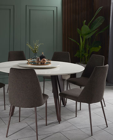
A beautiful, harmonious room isn’t just about throwing the trendiest furniture in and splashing expensive wallpaper on the walls. Perfectly designed spaces don’t just look good, they have to feel good too.
Texture adds visual weight and depth to an otherwise flat and inanimate object. The contrast when you play with textures help to keep things balanced visually, and when done well, can really bring a sense of harmony to your space. Without a trained eye, texture is a key area that is often overlooked by most when decorating their own homes.
Jonathan Kuok of Space Atelier was commissioned to design this 2,500 sqft Modern Lux apartment in Ion Residence. He has cleverly nailed the use of textures to turn an otherwise generic condominium into a luxuriously inviting space for the homeowners and their guests, away from the hustle and bustle of downtown. 
With comfort at the top of mind, the homeowners decided on a plush leather recliner sofa set and chose a bold colour - volcanic orange. Due to the striking colour of the sofa, the colour palette of the rest of the living room is kept neutral and warm to complement the sofa.
One of the most important tips to mastering the use of texture is to remember to layer. Try blending multiple different sources of materials to build the textural experience of your room.
In this living room, the use of the plush rug breaks up the large space and interrupts the monotony by introducing both physical and visual texture. The coffee table placed on the rug is two-tiered, with the smaller matte metal table nestled under the longer glossy black table with wooden legs. This curated mix and match of materials is a perfect example of how the homeowners brought in a spark of textural interest as they built layers around this space.

Another way to bring in texture into your living space is to use wood panelling, similar to how the homeowners here have created a feature wall around their TV area. The slatted wall installation in a dark walnut tone keeps the area looking warm and cosy, while the vertical lines draw your eyes upwards, which gives the illusion of a higher ceiling.
Chic and refined, the wall feature not only brings so much character to the space, but is also a much more timeless option compared to splurging on trendy wallpaper that may go out of style in a few seasons.

In the open-concept kitchen, you’ll notice how the glossy black cabinets are paired with the matte wood grain of the larger floor-to-ceiling cupboards which is again a play on mixing textures which makes for a show stopping backdrop for when someone is mixing cocktails and entertaining friends. The reflective nature of the glossy black cabinets throws light and creates a sense of movement in that space.
The juxtaposition of the glossy black kitchen cabinets next to the ivory dining chairs creates a dramatic contrast, which fashions an invisible delineation between the kitchen and dining area.

Last, but definitely not least, the right lighting will pull your entire space together. Throughout the open-concept floor plan of this living area which seamlessly flows into the kitchen and dining space, the homeowners successfully used textures to create intimate, separate spaces which work harmoniously with each other. Besides the neutral tones, the one thing that ties the large space together is the use of lighting. The false ceiling with cove lighting that runs throughout the space plays a big role in adding a much-needed layer of texture, providing a soft and ambient glow all around that is the finishing touch to a beautifully designed and furnished home.


